January 2024 User Experience Update

One of the core values of Dragon Metrics is saving our customers' time. We want to make sure you can get the data and analysis you need quickly — not spending all day in your SEO software.
Today we’re releasing an update that furthers this mission, bringing a completely redesigned interface and numerous user experience improvements, all focused on getting you what you need faster and easier.
Today’s update can be broken down into 3 primary components:
We have to admit, we’re pretty proud of our new omnipresent search box that can be found at the top of every page.

While it may look like your average search bar, there’s so much more to it — let’s take a look at some of the things it can do.
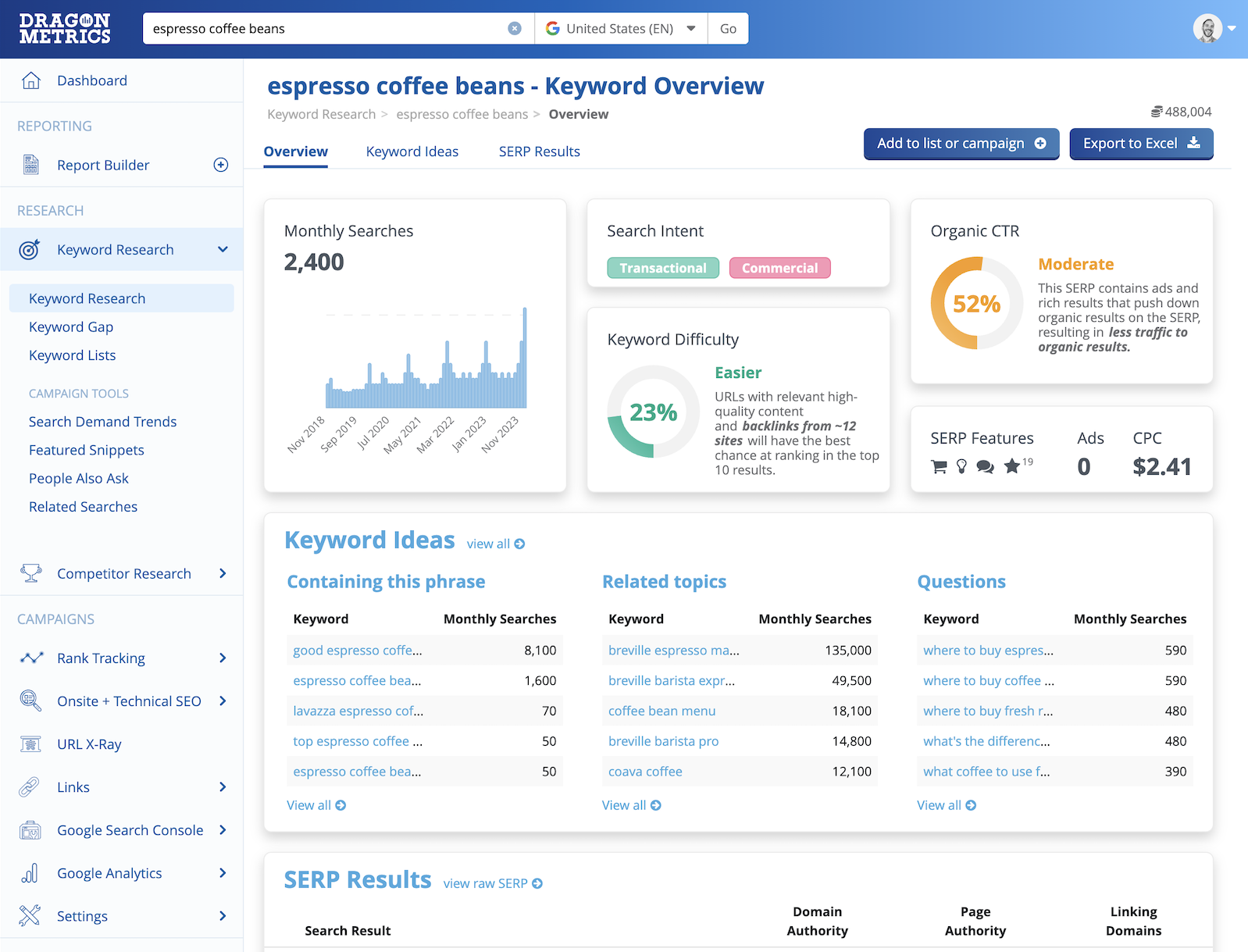
Enter a keyword to get detailed analysis and related terms.
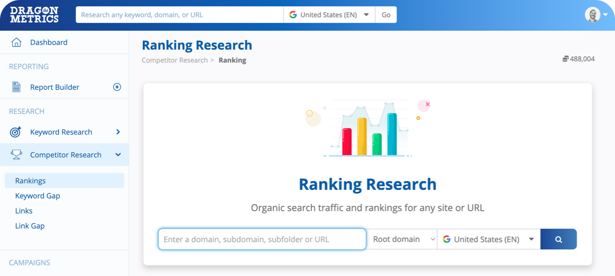
Enter a domain, subdomain, subfolder, or URL to see traffic and keyword rankings.
Choose Link Research for a detailed look at any site or URL’s backlink profile.
Navigate to any report or page in the platform simply by searching and clicking Go.
All 500+ articles from our knowledge base are instantly searchable from the Everything Bar. Simply type in your question or what you want to learn, and you’ll get a detailed step-by-step guide right inside the platform.
Type in the name of an automated report in Report Builder 2.0 for quick access.
Instantly see everything Dragon Metrics knows about any URL on your site by entering the page and choosing URL X-Ray.
See rankings, onpage content, optimization, Core Web Vitals, Indexation, internal links, backlinks, outbound links, Images, Google Analytics, Google Search Console, and more!
Enter the name of a keyword list you’ve saved to instantly jump to the report.
Many other actions are available via the Everything Bar, such as Create a new campaign, add new users, and more.
We’ve made numerous changes to the way the platform works to make it even easier for our users to navigate around the tool.
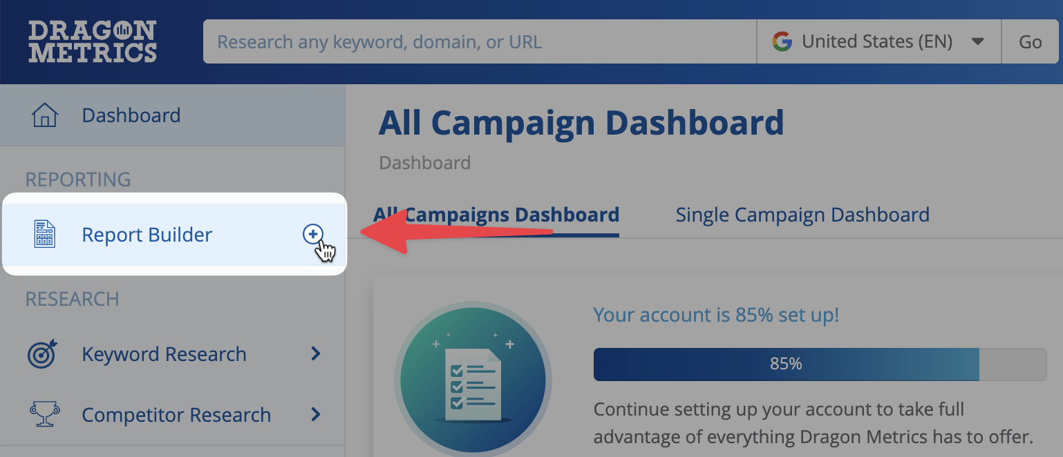
Click the + button in the navigation to instantly create a report from any page.

The search bar will now remember your most recently used settings, so you don’t need to re-select the same search engine, country, or language again every time.

We’ve redesigned and reorganized the tools in the platform. While it may be a big change, we think it’ll be much easier to find what you’re looking for quickly.

Want to see exactly what’s changed? We’ve detailed all of the changes in the navigation in our help center.
We understand that big updates can seem a bit scary, but don’t worry — we’re confident you’ll find the new interface much easier to use, and as always we’re here to assist along the way.
Our team would be happy to meet with you for a 1-on-1 guided tour of today’s new update. All you have to do is choose a time that suits you! We’re also always available to answer straight away via live chat.
Finally, we to hear you feedback on the new design — whether you love it, hate it, or have any suggestions, please drop us a line. and let us know what you think.